The Successful Brochure Layout
Date: 10/25/2013 Written by: Launchmark
Last Updated on 12/06/2023 by Launchmark Insights
Last Updated on December 6, 2023 by Launchmark Insights
Laying out information in a brochure for a business is a balancing act with the details weighing in on one end and the entertainment factor on the other side. By adhering to the successful brochure layout ingredients that follow, you will be printing the best possible version of your business message.
Graphics
Choose the most relevant, interesting and unexpected images to illustrate your company’s agenda in your brochure layout. Save the most intriguing graphics for the front cover of your brochure to increase the chances that people will actually pick it up.
Colors
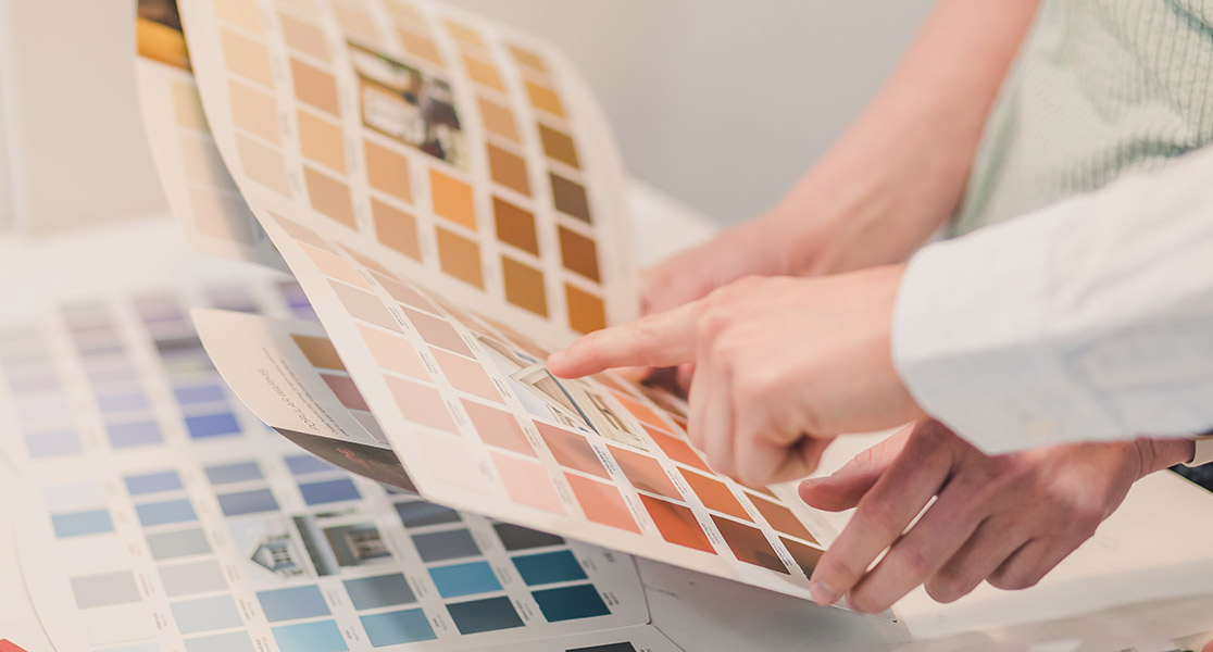
Try to limit your color palette to one really fancy, vibrant color and allow the rest to be less exciting. The last thing you want on your brochure is a large array of crazy colors all competing for people’s attention, and doing nothing but overwhelming them.
Text
Keep the amount of text on your brochure’s front cover relatively small. The main pieces of information for the front should be the company’s name, a product name and an applicable yet catchy slogan. Inside the brochure you can supply the details that apply to your products and services, like prices, ingredients, special features and benefits. The back cover is a great place to print out company contact information.
Details
Keep the details in your business brochure layout short enough to read, roughly in the time that it takes to wait to be called upon in a doctor’s waiting room and informative enough for customers to realize what you are offering and why they need it.
Visibility
Keep clarity in mind when you are preparing a company brochure layout. Choose text fonts that are effortless to read and don’t contain letters that can be confused with other symbols. Save the more elaborate fonts for large headlines and simplistic fonts for the information inside your brochure.


